Painting A Victorian Home
 Victorian Home Paint Colors
Some people wonder why Victorian homes were painted certain colors back in the mid-1800s. Honestly, I am way too young to answer that, but what I can tell you from some research is that certain "paints" were used because it was what was available. In fact, paints weren’t what we know them to be now. Instead, they were pigments created from certain ingredients. So something like cabernet red was easier to create than blue because of the pigments available such as mercuric sulfide which has a red crimson tint to it. Of course back then colors that were widely used in "painting" homes included a variety of colors, but most of the homes we see today are also those colors simply because A) the buildings are landmarks and cannot be changed or B) because, well, that’s how people like them to stay. If you are thinking about hiring a top house painter in NJ and you want to paint a Victorian house Victorian colors or you have a regular house and you just like the color concepts of Victorian homes, you will need to know what proper colors to use. Read below for more information on the best colors to use.
Strong Contrasts
It’s funny how you can paint a Victorian home one color and those colors look fantastic, but painting them on any other home just looks like a mess. This one is not really for the faint of heart and you might be better off adding it to a real Victorian house, not just for a theme. This one would include strong contrasting colors such as a gray blue body (front, back and sides), with stark white trim. Add in some crimson red accents and you have a copy of the Queen Anne. These colors create a really crisp look, but these colors are also rooted in tradition, and if you have a Victorian home from the 1800s, that might mean everything to you! Some specific colors to consider are Skipper (body), Divine Pleasure (trim), and Burnished Mahogany (accents).
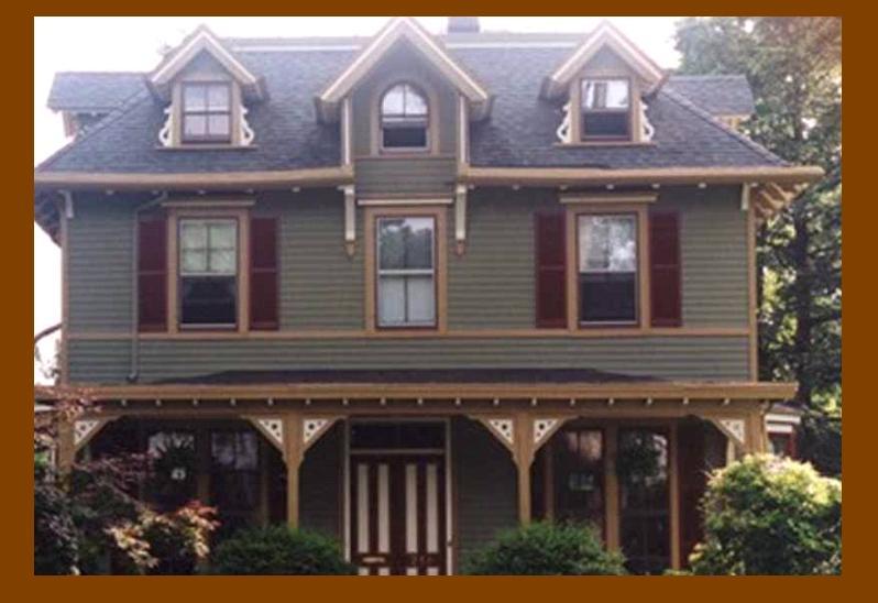
Historical Period
Most people will tell you that when it comes to Victorian Homes, there IS such a thing as too many colors. Most of the time with these types of homes you want to stick with under 5 colors and with more than 3 colors. For this specific home we will have four colors. They highlight the beautiful features and style of a Queen Anne style home. This home is unlike the others in that it uses two different colors on the siding to help set the clapboards away from the shingles. It’s a very easy and yet tricky way to differentiate between the different parts of the house and any professional top house painter should be able to do this for you. Colors for this home include colors you might not expect from this type of home, but they are traditional just the same with tans, beiges, whites and a terracotta for the porch and accents. Consider these colors from Sherwin Williams: Beige (clapboards), Sycamore Tan (shingles), Divine White (trim), and Rookwood Terra Cotta (porch floor and accents), from Sherwin-Williams.
Queen Anne Copy
If you have a Queen Anne or you like the above mentioned option, but you want different colors consider this scheme; it uses deep woodland greens, grays and blue greens. It’s a little different than the same old same old, but it looks fantastic just the same. If you are a little worried about the colors, consider getting a few paint samples from a local paint store, hang them on the wall and live with them for a few days and see if they really are colors you love! I say love, because when it comes to exterior colors, these are colors you are going to be living with for a while and if you just "eh" them or like them, chances are you are going to get sick of them quickly. Some color schemes to check out for this type of home are: Rookwood Blue Green (clapboards), Renwick Heather (shingles), Rookwood Sash Green (window surrounds and fascia’s), Rookwood Shutter Green (window sashes and porch spindles), and Plum Dandy (porch posts), from Sherwin-Williams
Authentic and Warm
This is one of those textured homes that everyone comes to expect from a Victorian home. It has all the perfect colors and the scheme is fantastic, but that little addition of textured stone just tops it all off. This specific house would use a lot of different textures. You can obviously choose one or two, or three if you really want to. But, make sure you use things like this one does such as natural stone, brick and even sand. Yes, sand! This house includes very warm colors that make the home seem inviting and cozy on the inside. Colors include tans, dark cherry, and taupe just to name a few. Here are some colors to consider: Apache Tan (body), Sleeper's Entry (trim), Tyson Taupe (window sashes), North Gallery (banding under Turkish-style dome), and Cherry Cola (accents). See California Paints for dealers.
Strong Contrasts
It’s funny how you can paint a Victorian home one color and those colors look fantastic, but painting them on any other home just looks like a mess. This one is not really for the faint of heart and you might be better off adding it to a real Victorian house, not just for a theme. This one would include strong contrasting colors such as a gray blue body (front, back and sides), with stark white trim. Add in some crimson red accents and you have a copy of the Queen Anne. These colors create a really crisp look, but these colors are also rooted in tradition, and if you have a Victorian home from the 1800s, that might mean everything to you! Some specific colors to consider are Skipper (body), Divine Pleasure (trim), and Burnished Mahogany (accents).
Historical Period
Most people will tell you that when it comes to Victorian Homes, there IS such a thing as too many colors. Most of the time with these types of homes you want to stick with under 5 colors and with more than 3 colors. For this specific home we will have four colors. They highlight the beautiful features and style of a Queen Anne style home. This home is unlike the others in that it uses two different colors on the siding to help set the clapboards away from the shingles. It’s a very easy and yet tricky way to differentiate between the different parts of the house and any professional top house painter should be able to do this for you. Colors for this home include colors you might not expect from this type of home, but they are traditional just the same with tans, beiges, whites and a terracotta for the porch and accents. Consider these colors from Sherwin Williams: Beige (clapboards), Sycamore Tan (shingles), Divine White (trim), and Rookwood Terra Cotta (porch floor and accents), from Sherwin-Williams.
Queen Anne Copy
If you have a Queen Anne or you like the above mentioned option, but you want different colors consider this scheme; it uses deep woodland greens, grays and blue greens. It’s a little different than the same old same old, but it looks fantastic just the same. If you are a little worried about the colors, consider getting a few paint samples from a local paint store, hang them on the wall and live with them for a few days and see if they really are colors you love! I say love, because when it comes to exterior colors, these are colors you are going to be living with for a while and if you just "eh" them or like them, chances are you are going to get sick of them quickly. Some color schemes to check out for this type of home are: Rookwood Blue Green (clapboards), Renwick Heather (shingles), Rookwood Sash Green (window surrounds and fascia’s), Rookwood Shutter Green (window sashes and porch spindles), and Plum Dandy (porch posts), from Sherwin-Williams
Authentic and Warm
This is one of those textured homes that everyone comes to expect from a Victorian home. It has all the perfect colors and the scheme is fantastic, but that little addition of textured stone just tops it all off. This specific house would use a lot of different textures. You can obviously choose one or two, or three if you really want to. But, make sure you use things like this one does such as natural stone, brick and even sand. Yes, sand! This house includes very warm colors that make the home seem inviting and cozy on the inside. Colors include tans, dark cherry, and taupe just to name a few. Here are some colors to consider: Apache Tan (body), Sleeper's Entry (trim), Tyson Taupe (window sashes), North Gallery (banding under Turkish-style dome), and Cherry Cola (accents). See California Paints for dealers.
